


Males Tamales — Brand & Creative Direction, 2020
The Concept
Some of my earliest memories are waking up to the smell of coffee and tamales already on the table. My parents have been making tamales for years, and when it came time to build a visual identity for the business, I didn't want to invent something new — I wanted it to feel like it had always existed, the way that smell always did. The goal was a look that read as classic and familiar, rooted in the markets and kitchens the recipes came from.
The Palette
The blue-and-white color story is a direct nod to the cups my grandmother had, and the same blue-and-white you'd see at market stalls growing up. It's an instantly recognizable pairing to anyone who's spent time around a Mexican market — timeless, a little worn-in, and immediately trustworthy. That's the feeling I wanted the palette to carry: familiar and warm, like it had always been there.
The System
That palette became the foundation for the logo, textured type, and recurring visual elements across the brand. From there, the identity extended into the day-to-day: market announcements, bilingual signage, payment signs, and printed materials — all built to speak directly and warmly to customers.
Merchandise
The visual language carried through into hats, shirts, and menus, paired with "Tamalitos hechos con mucho amor" — keeping the merch connected to the family behind the food, not just the brand on top of it.


DA’VAE — Single Artwork & CD Packaging 2024
Physical Assembly
Printed the artwork, mounted it to a physical CD, and scanned the assembled piece to create real depth and texture.
Scanned Artwork
Adjusted the scan in post to bring out the color, texture, and dimensionality of the physical piece.
Final Artwork
Final version with handwritten elements added by the artist.

Creative Direction & Graphic Design — 2025
Flyer created for a Black Pop Presents show at Elsewhere in Brooklyn. The design combines bold typography, halftone textures, and a limited two-color palette inspired by DIY show flyers and printed zines.

Creative Direction, Photography & Graphic Design — 2021
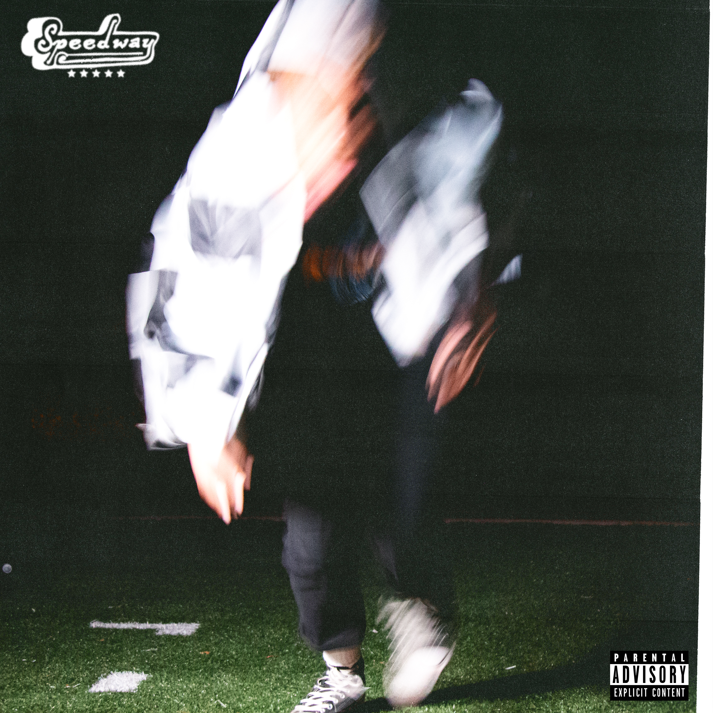
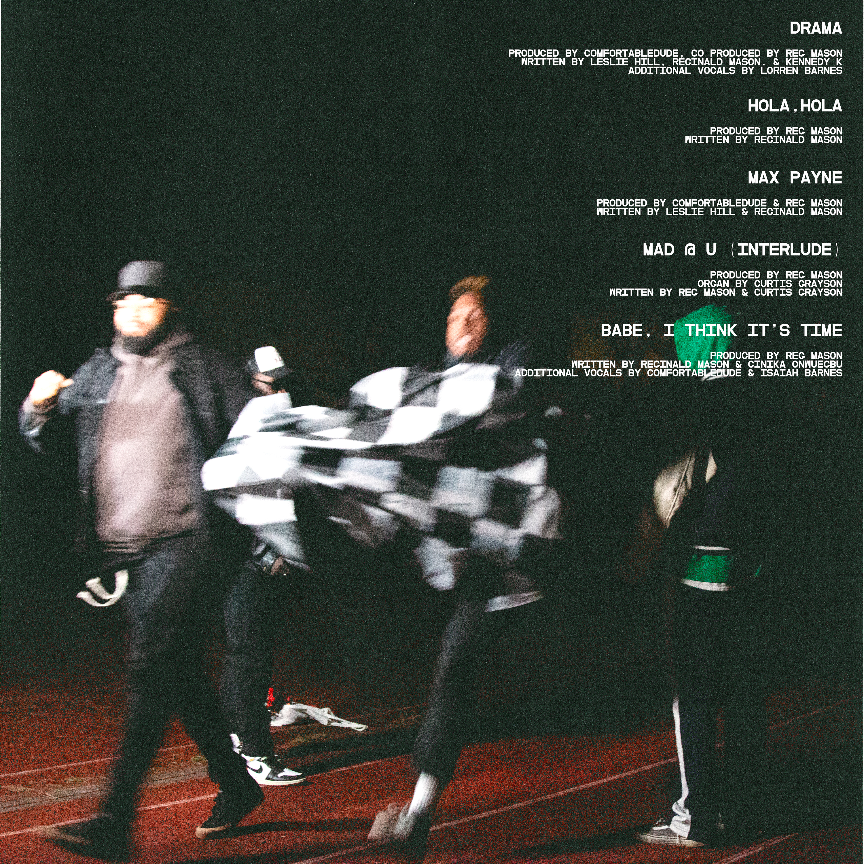
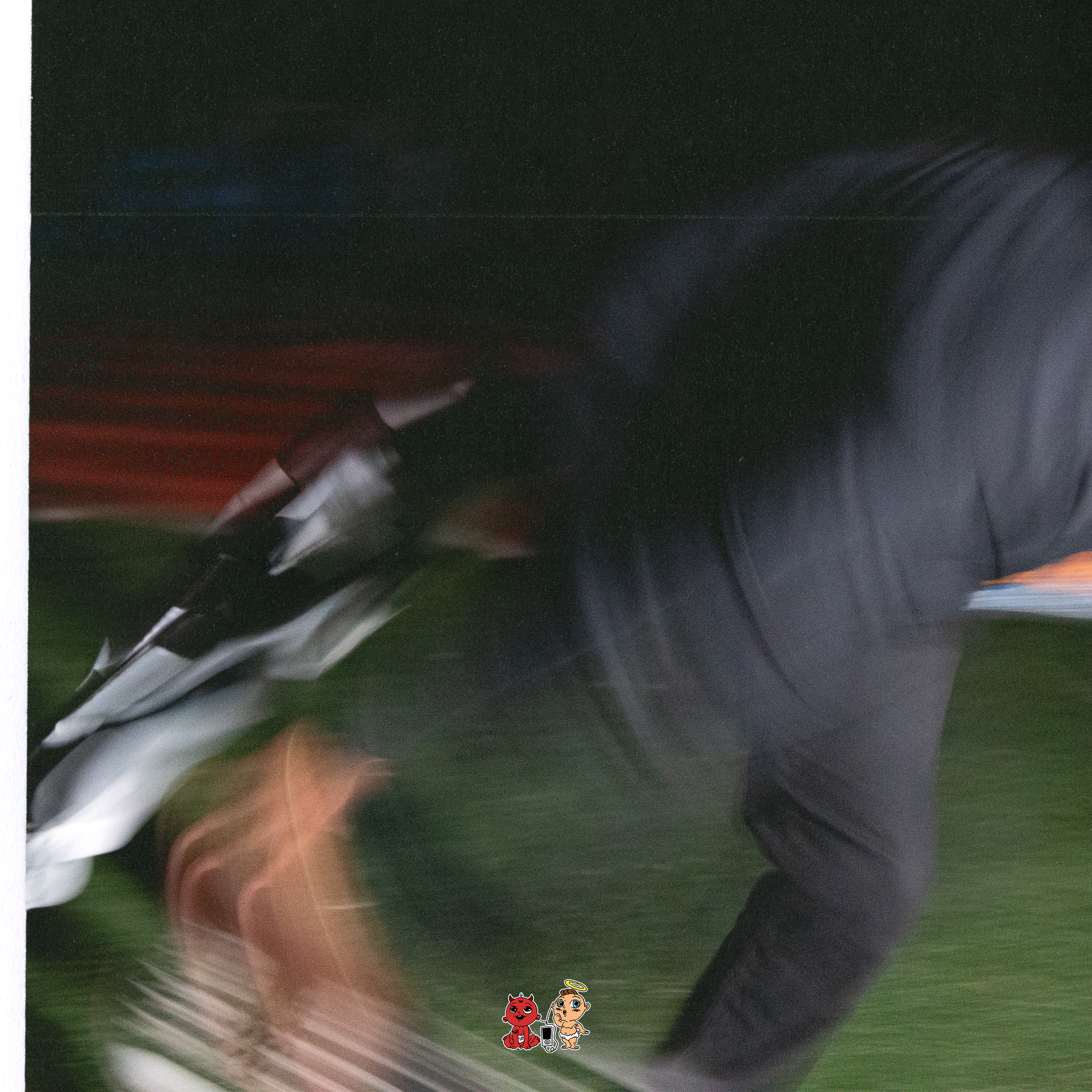
Developed the visual identity for Reg Mason’s album Speedway through a collaborative creative process spanning photography, image editing, and album packaging. Original photography was used across the cover, back cover, and booklet, with the final design system built around motion, blur, typography, and the visual language of the project.
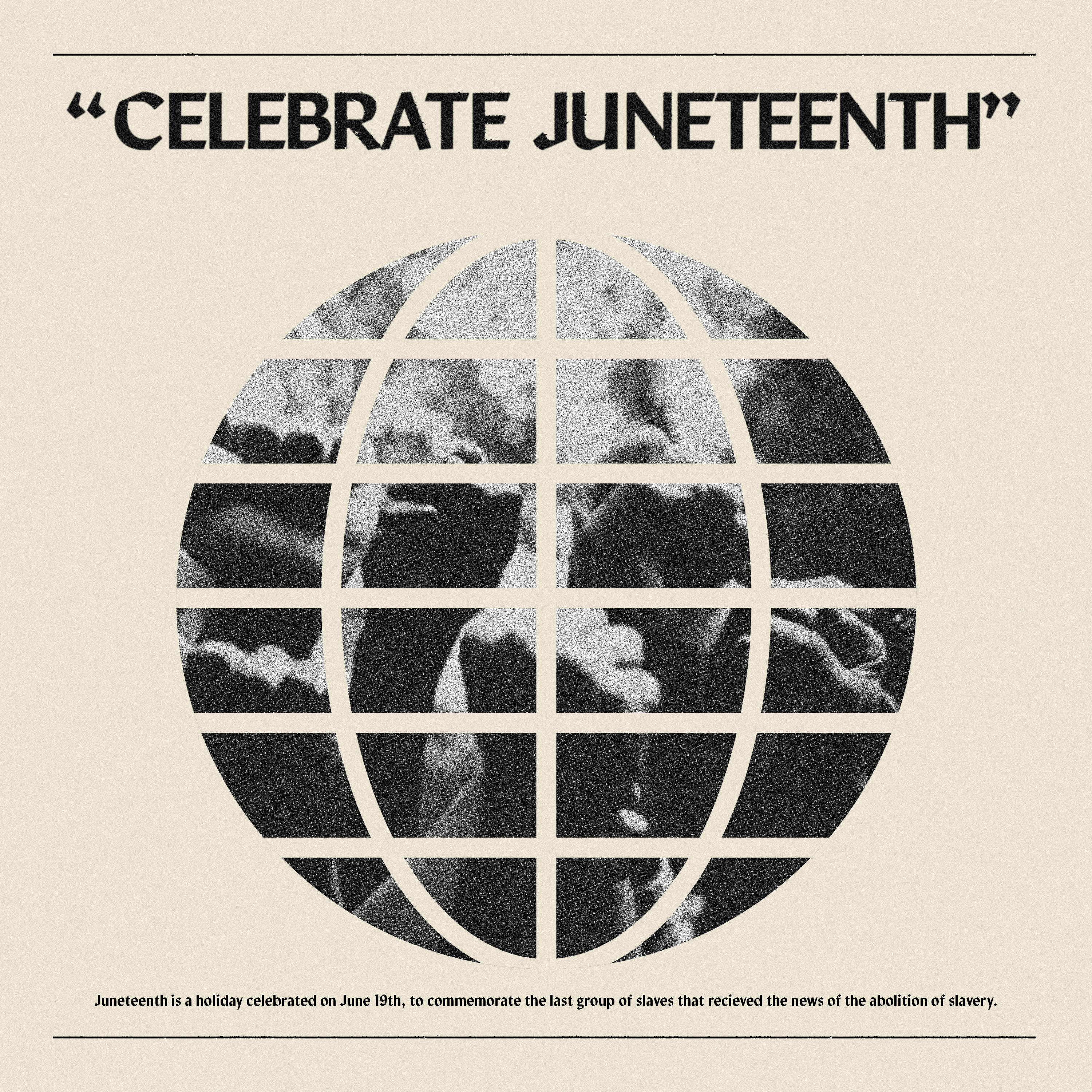
Graphic Design & Art Direction
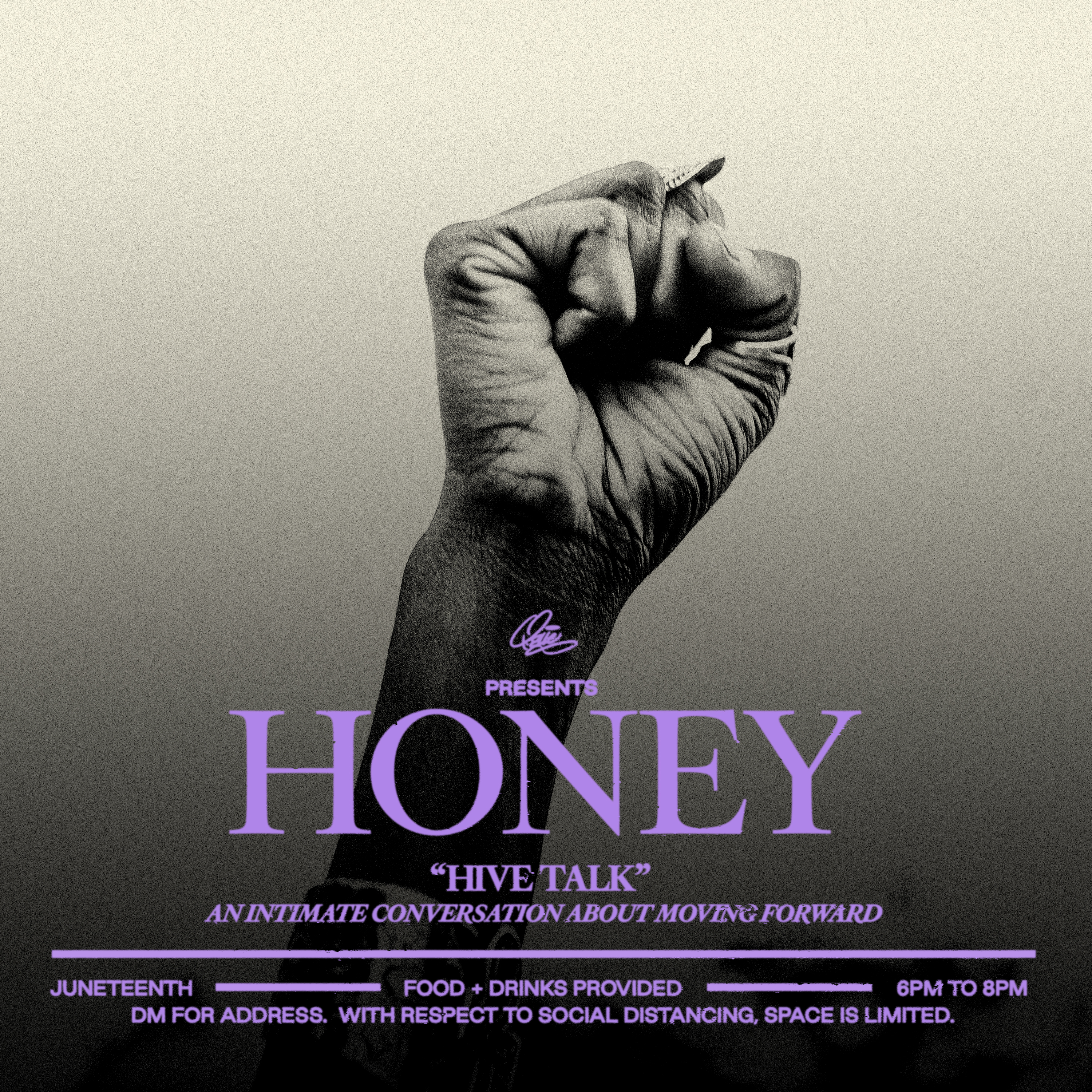
Promotional graphics created for a Juneteenth discussion panel centered on conversation, community, and moving forward. The visual direction combined archival imagery, bold typography, and contrasting layouts to create a set of event flyers that felt both editorial and direct.
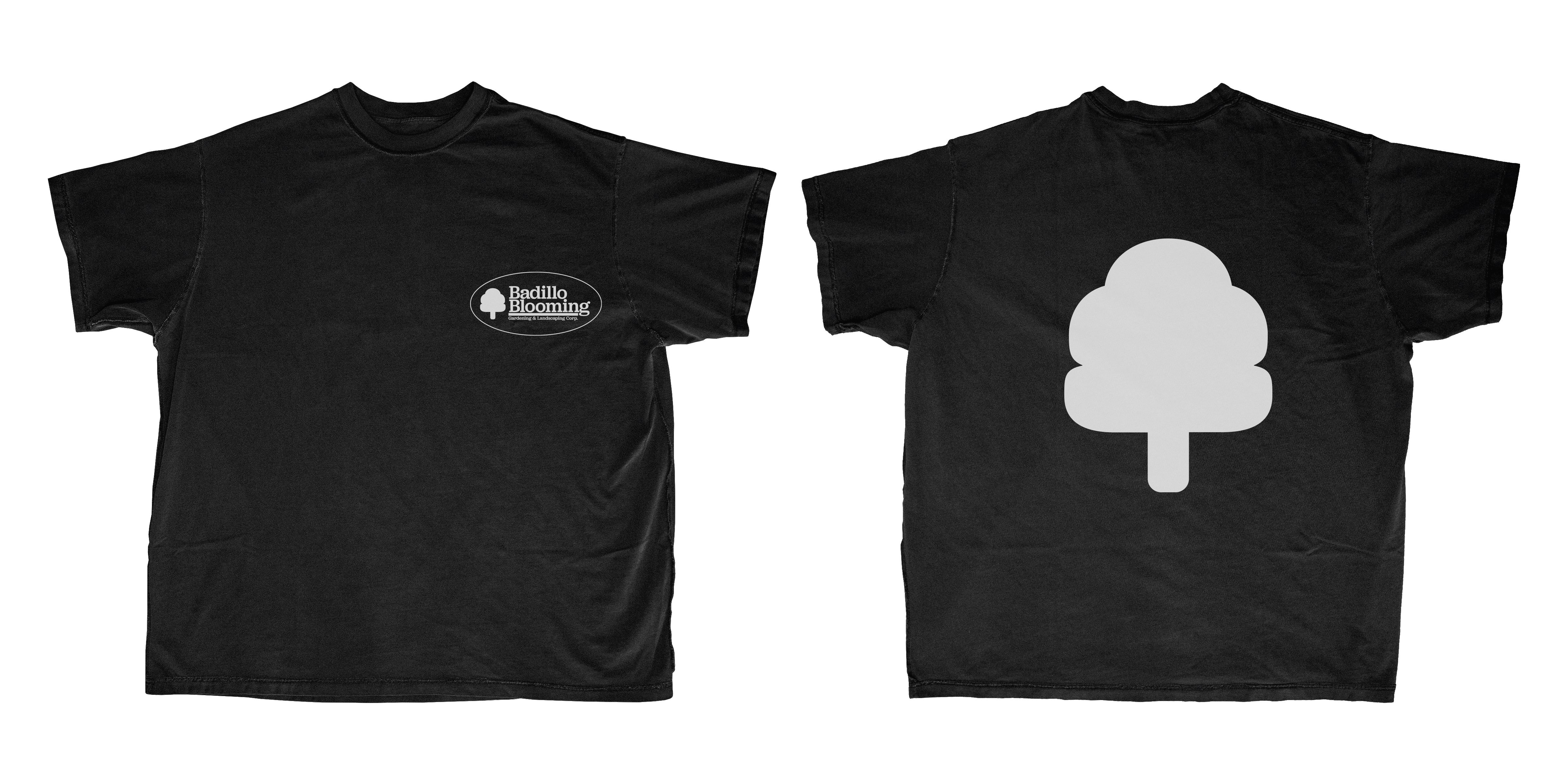

Brand Identity Exploration & Graphic Design
Conceptual rebrand for a family-owned landscaping company, exploring two visual directions for a refreshed identity. One concept transforms simple forms into a tree-like symbol, while the second uses similar geometry to suggest a valley or landscape. The concepts were extended into apparel mockups to explore how each identity could translate across applications.
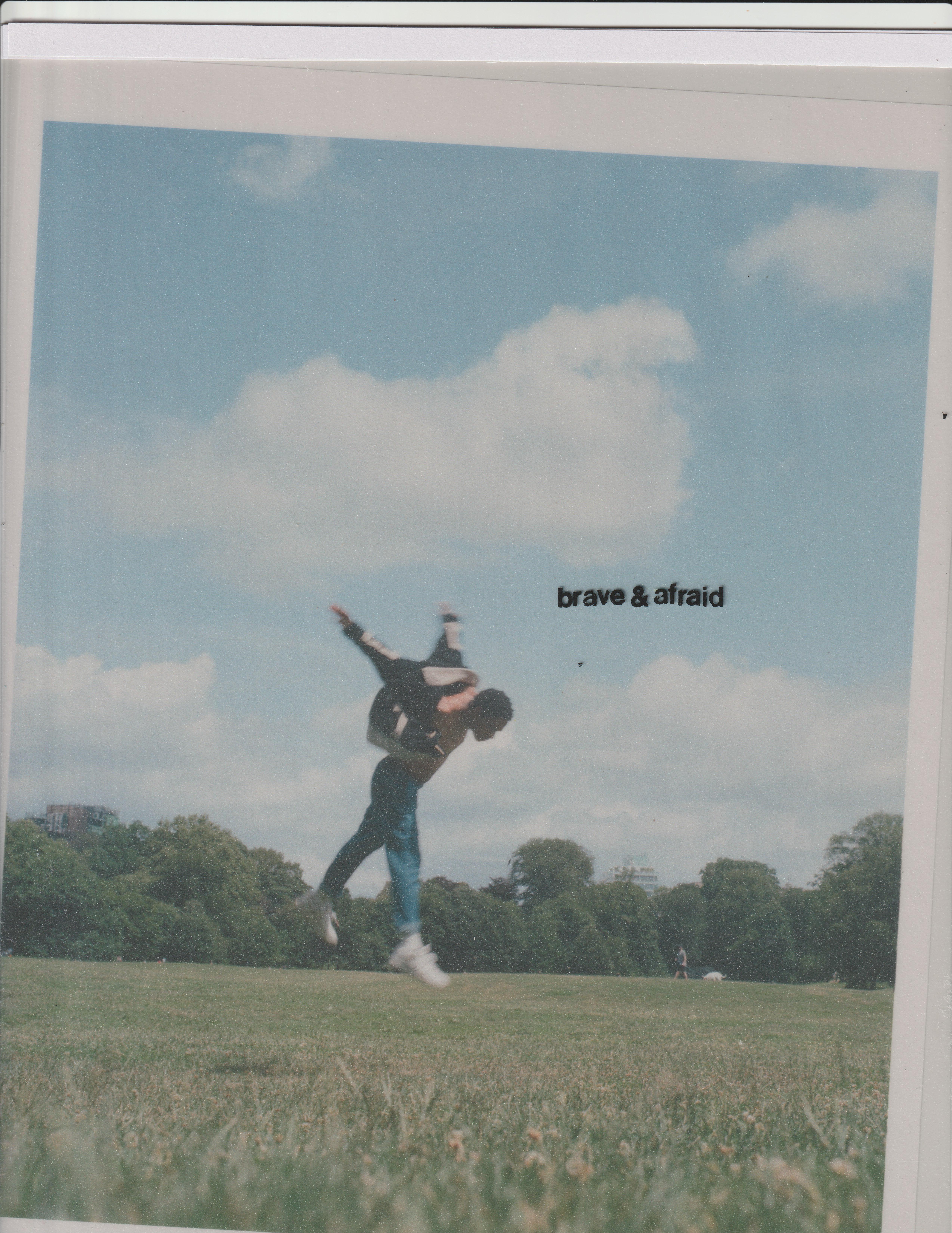
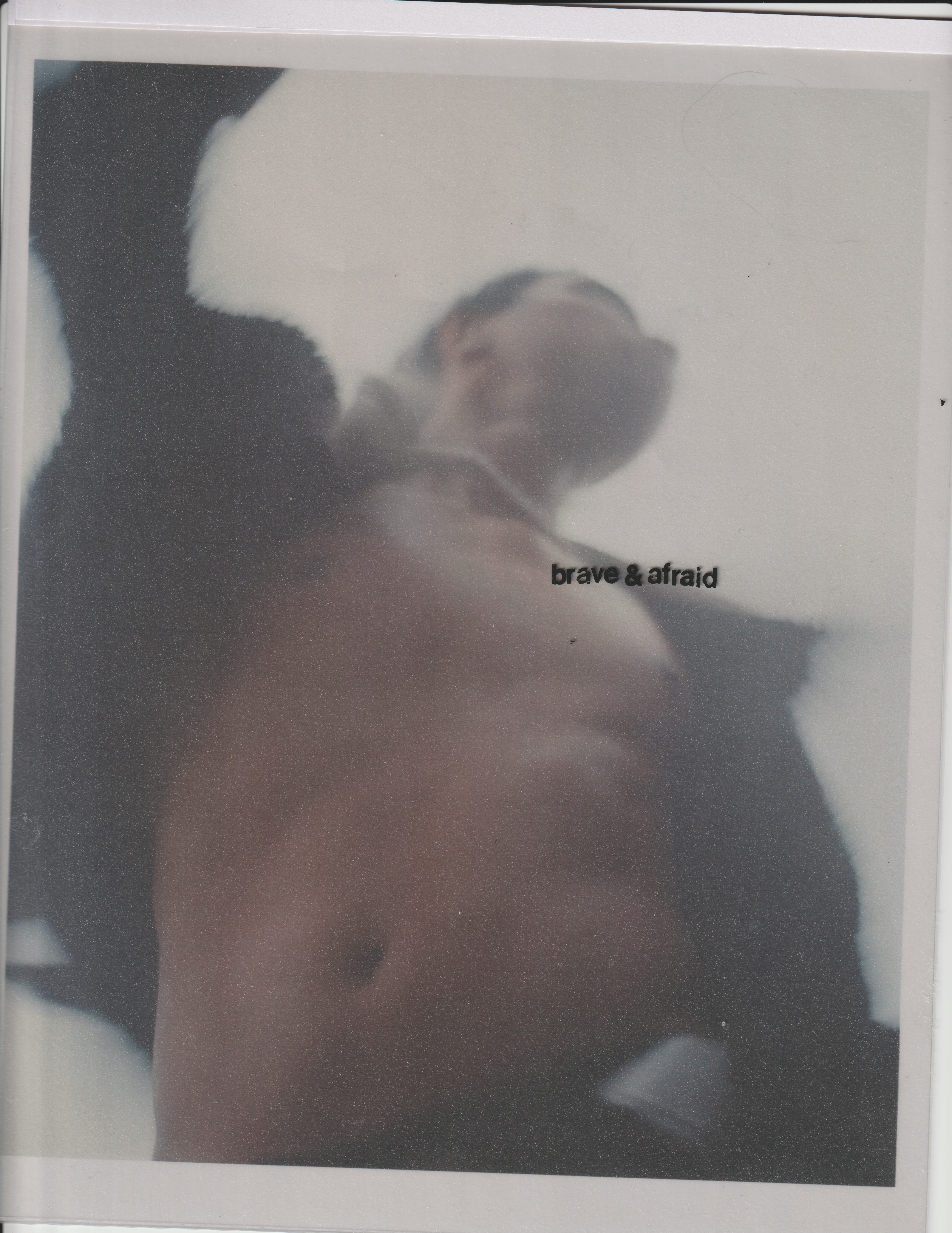
Marques Martin-Brave & Afraid
Photography, Creative Direction & Graphic Design
Alternate cover artwork for Marques Martin’s Brave & Afraid, created using original photography, printed paper, overhead transparency film, and dry-transfer lettering. The analog process embraces imperfections in texture, registration, and typography to create a tactile, handmade finish.


BINKI — SEASICK
Photography, Creative Direction & Graphic Design
Photography, cover art, and promotional imagery for Binki’s Seasick. The project combined original photography with hand-drawn elements, collage, and digital manipulation, with select images later used for Binki’s BENEE support dates.
Motion Design & Visual Exploration
A series of self-initiated experiments created during quarantine while exploring After Effects and new approaches to motion design. The studies became an outlet for translating frustration and isolation into movement, texture, typography, and visual experimentation.
A series of self-initiated experiments created during quarantine while exploring After Effects and new approaches to motion design. The studies became an outlet for translating frustration and isolation into movement, texture, typography, and visual experimentation.